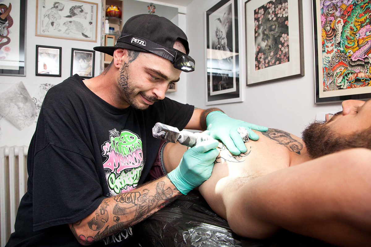
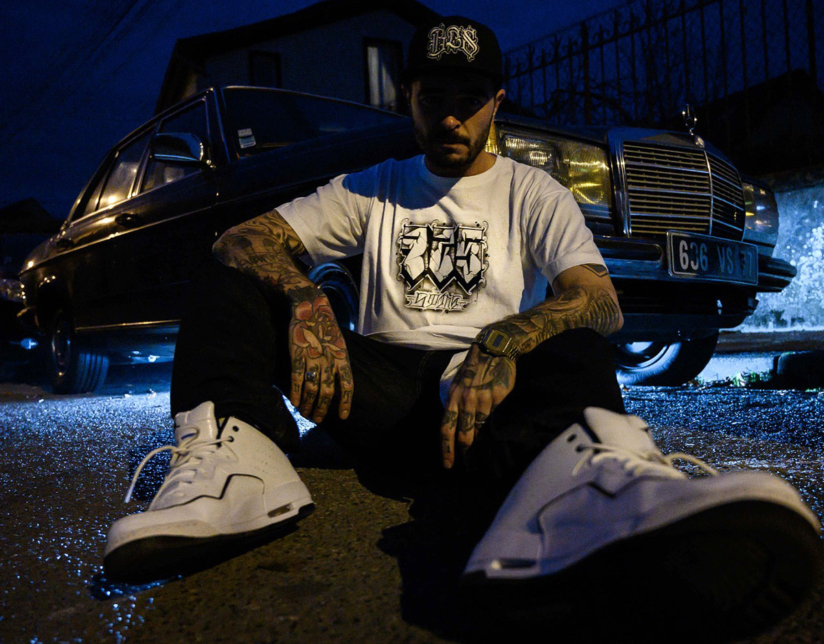
The French tattooist Fat Kush has been involved in graffiti before immersing himself in lettering. He explains his artistic research, which is more than ever oriented towards the dark and the abstract.
Can you please tell me a little about yourself?
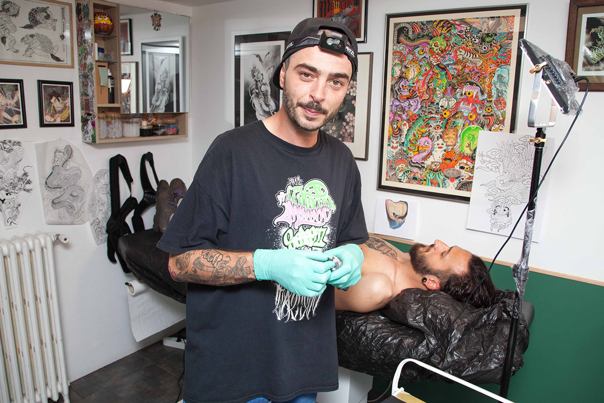
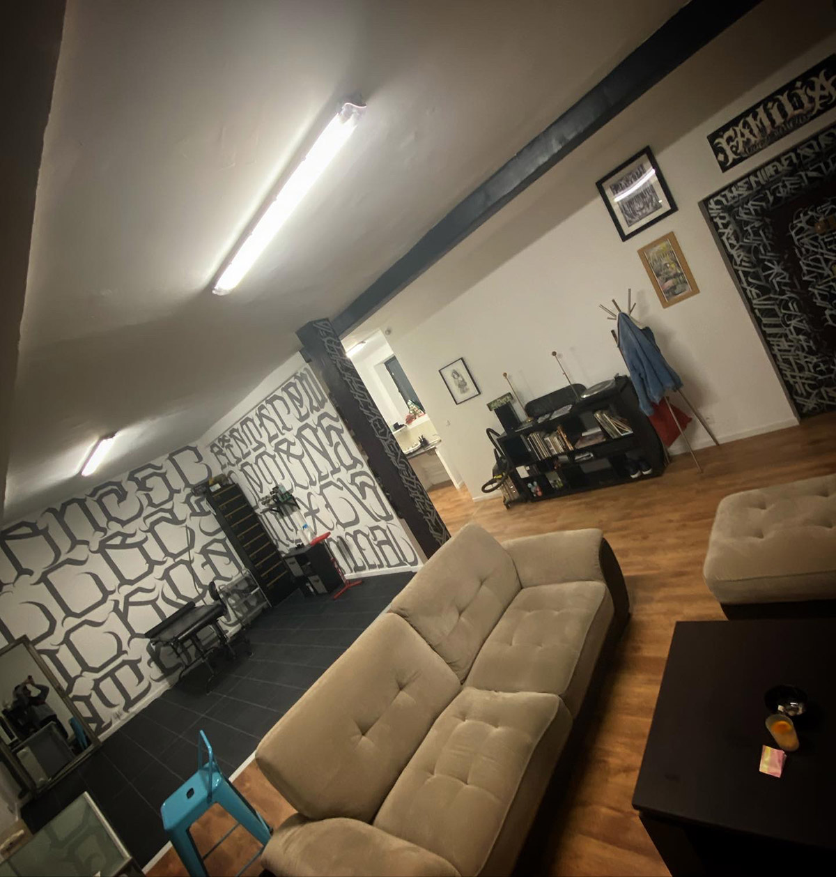
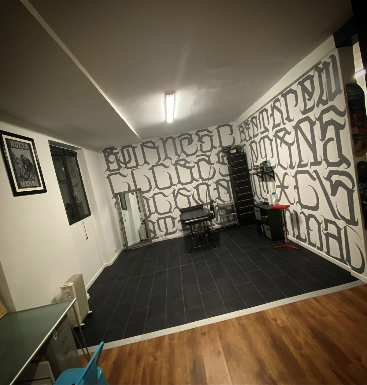
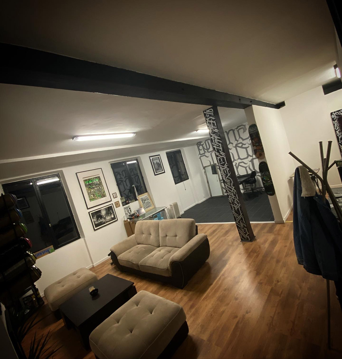
I am 33 years old and I come from Seine et Marne, from Lagny sur Marne where I opened a shop after the Covid, located in artists' studios and where I work with my best friend: 725 SIDE SHOP. I'm currently planning to move to Lyon, so I'll keep an eye on that.
What is your path to tattooing?
Quite classic, we'll say school and then BEP electrotechnics... But I wasn't very academic. I learned other things, like the letter in graffiti. A love that I've cultivated since I was 14, when I was caught up in graffiti, before arriving naturally at tattooing with this desire to continue to make letters. Two disciplines that ultimately merge.

How did it happen?
I always wanted to touch the lettering culture. When I went to my training master Shooby, my Jedi master I should say for the last seven years, he introduced me to the different styles before I got into lettering.
How has your lettering work evolved in the seven years you've been tattooing?
I first worked a lot on Chicano lettering because I was very attracted to the Chicano lowrider graff culture. I went to San Francisco to observe it myself.
Can you tell us about it?
It goes back to my first visit to the United States, for the Sacramento Convention, after being contacted by an American tattoo magazine who wanted to do an interview. I met my buddy Joseph, who is based there and has become a very good friend, who gave me the opportunity to work. I went back and forth for a year and I loved mixing with the culture. I did graffiti there, ate local food, I was really immersed in the Chicano culture. The tattoo scene is different there, especially the lettering. It's different when a client comes in and puts his gun on the bench!
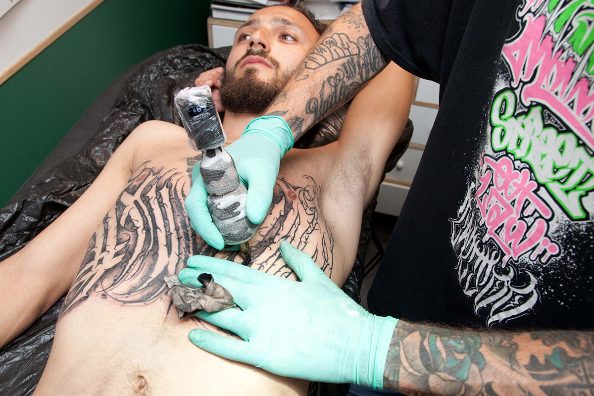
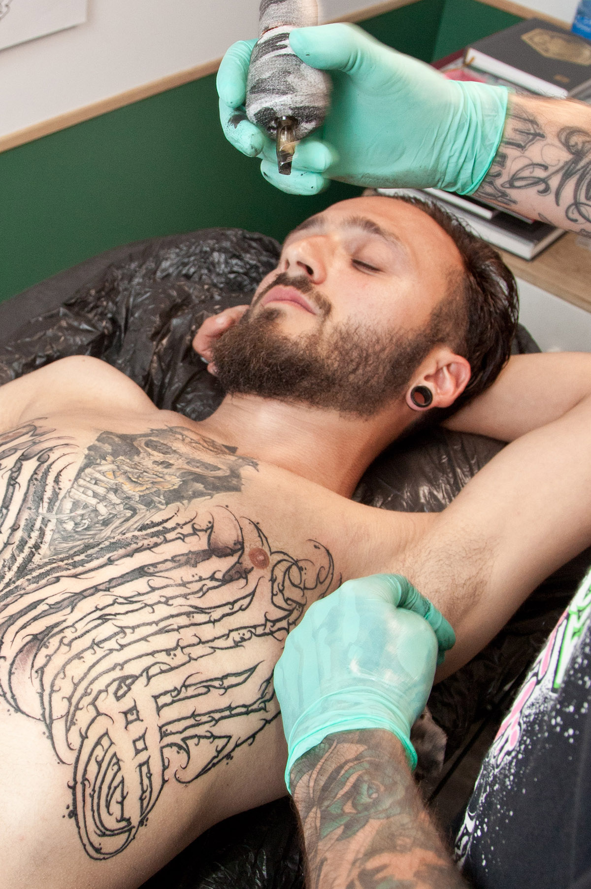
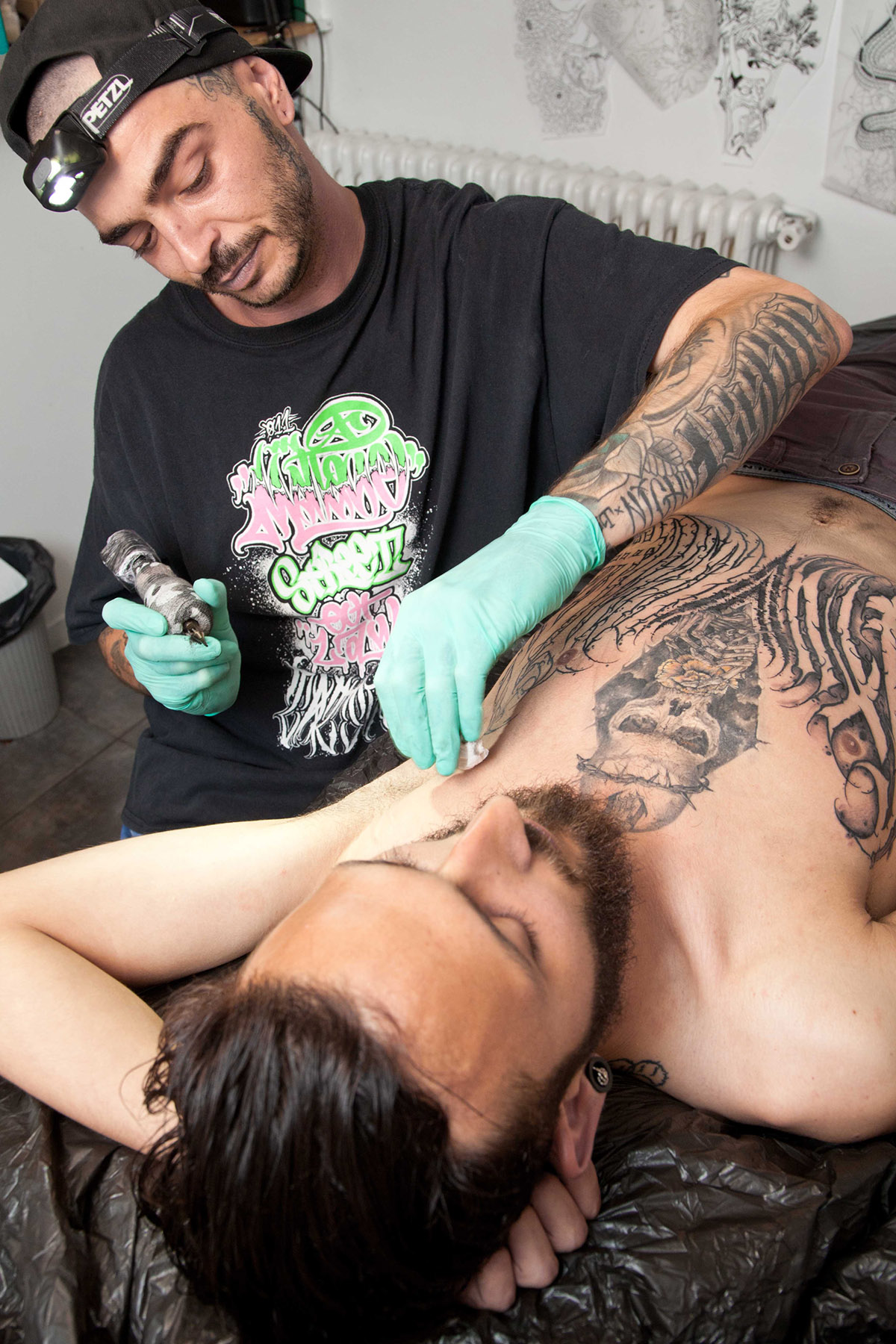
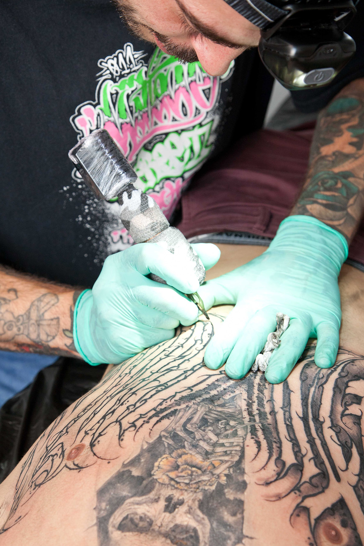
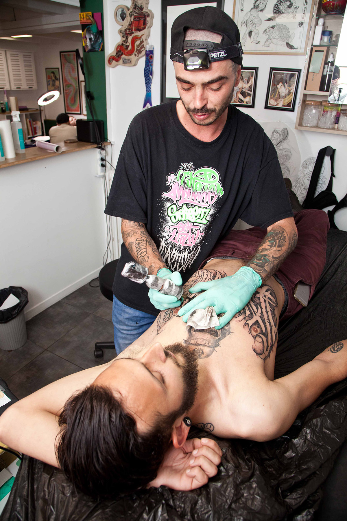
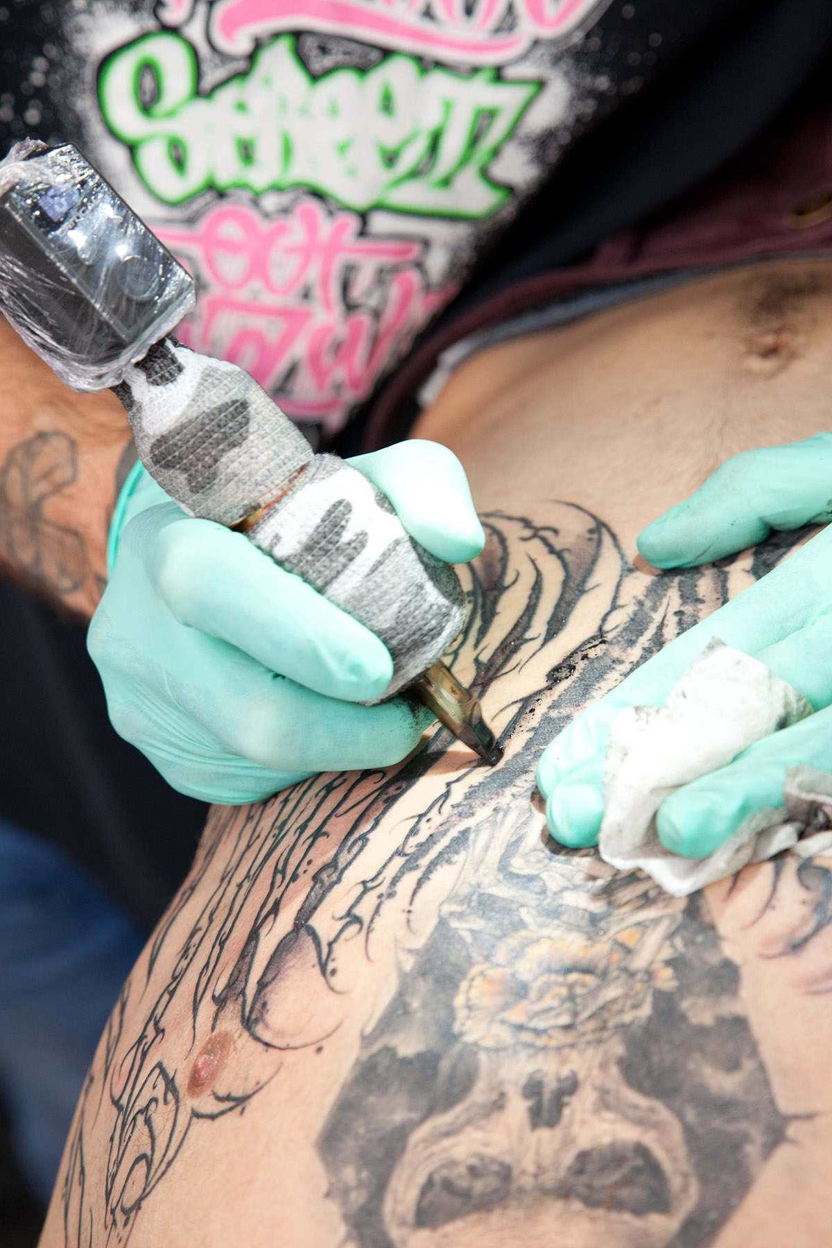
Technically, how do you approach your pieces?
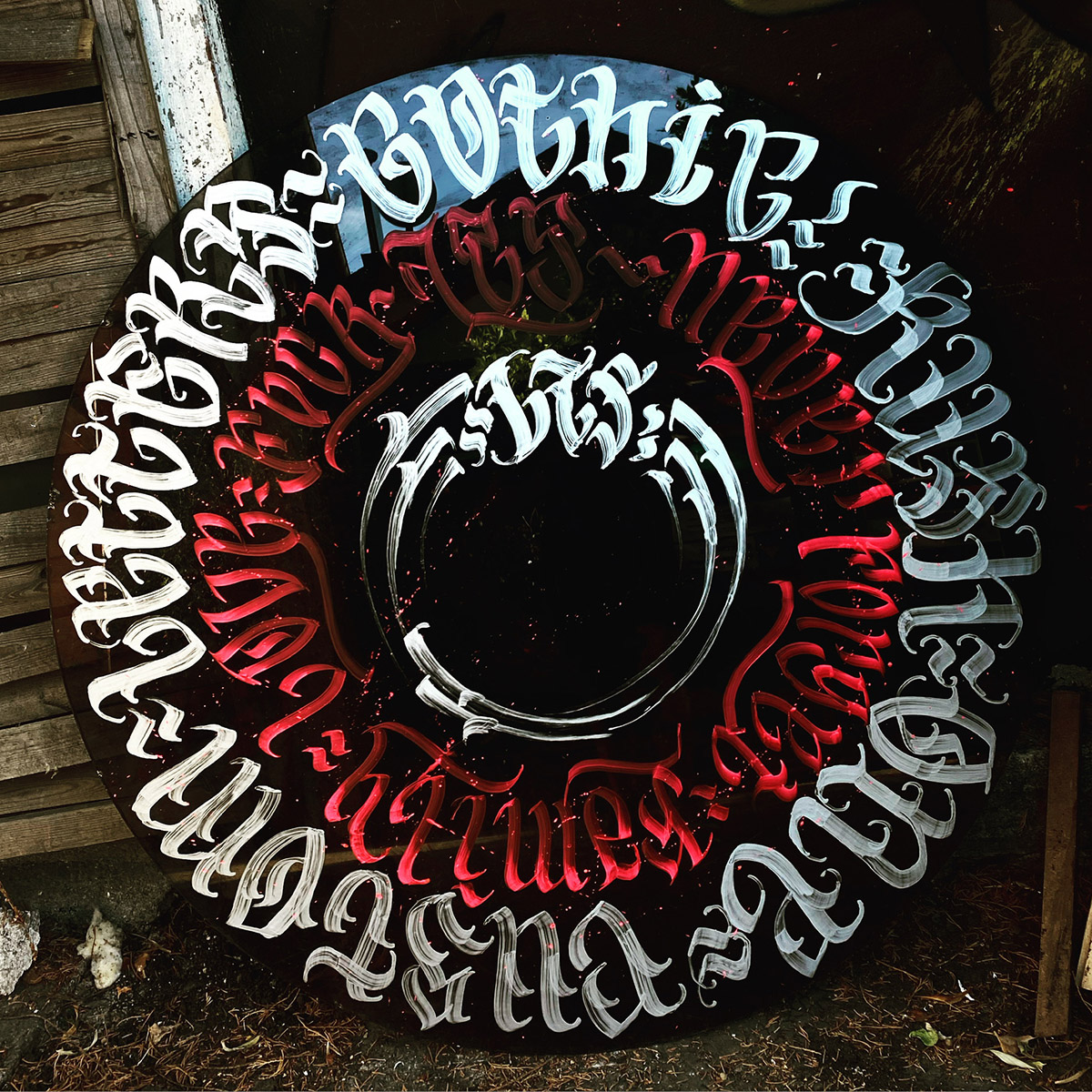
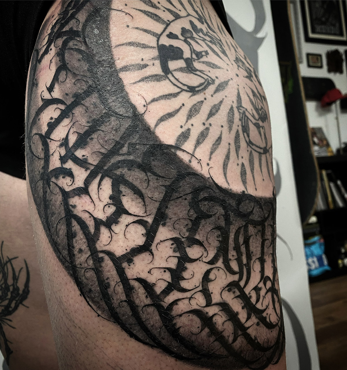
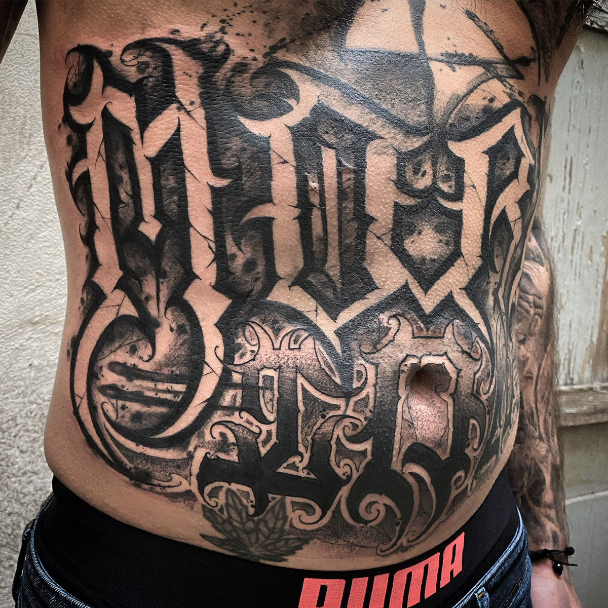
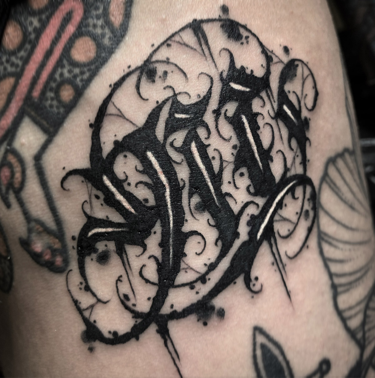
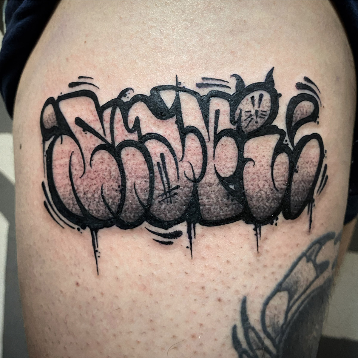
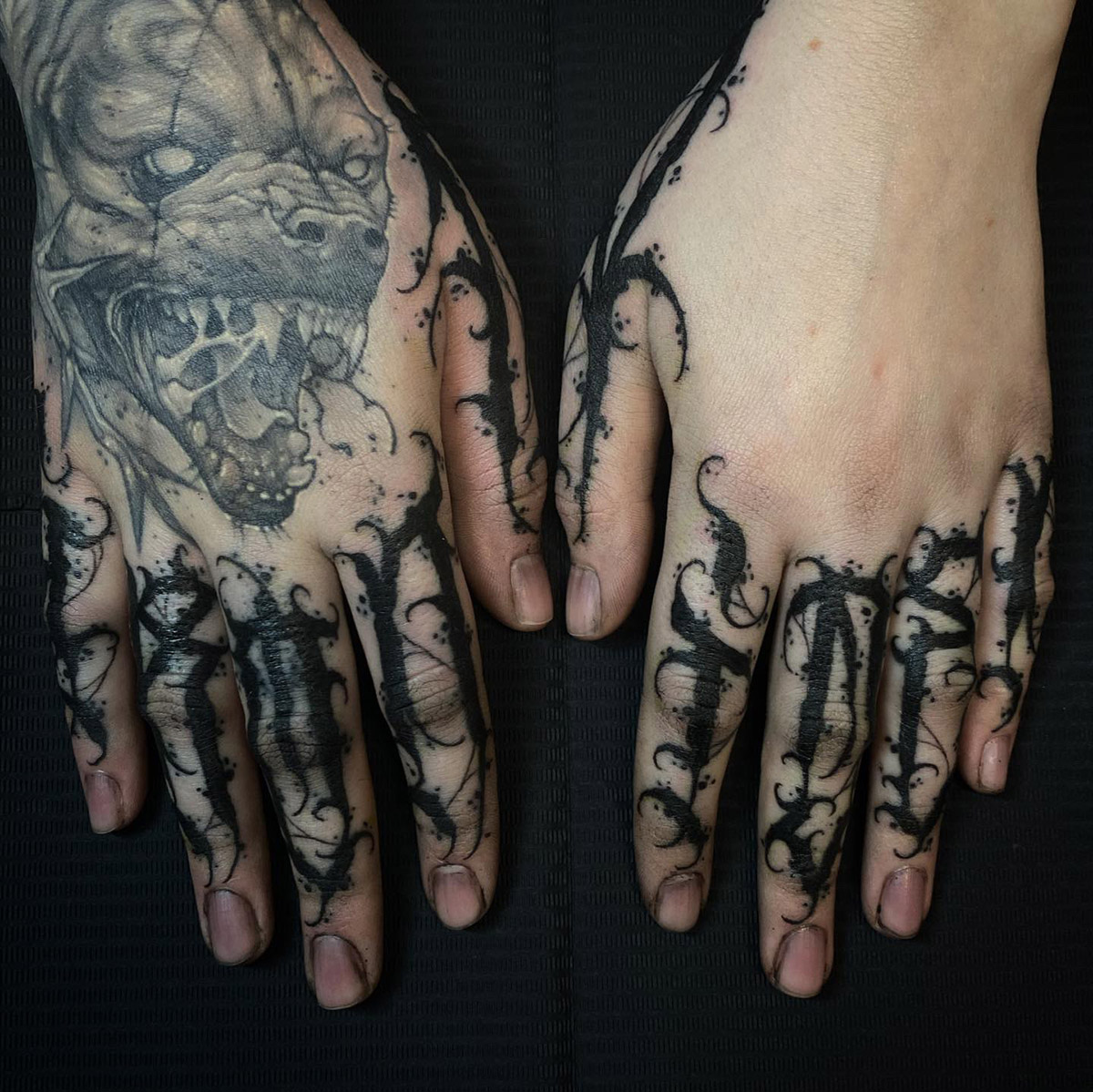
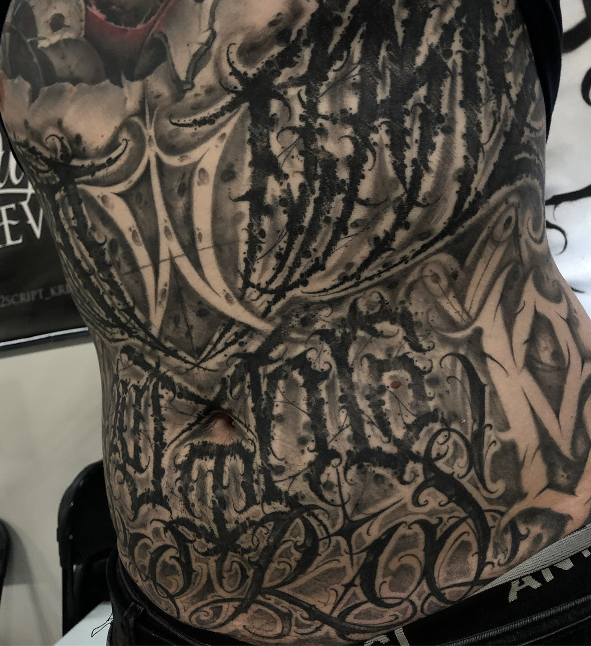
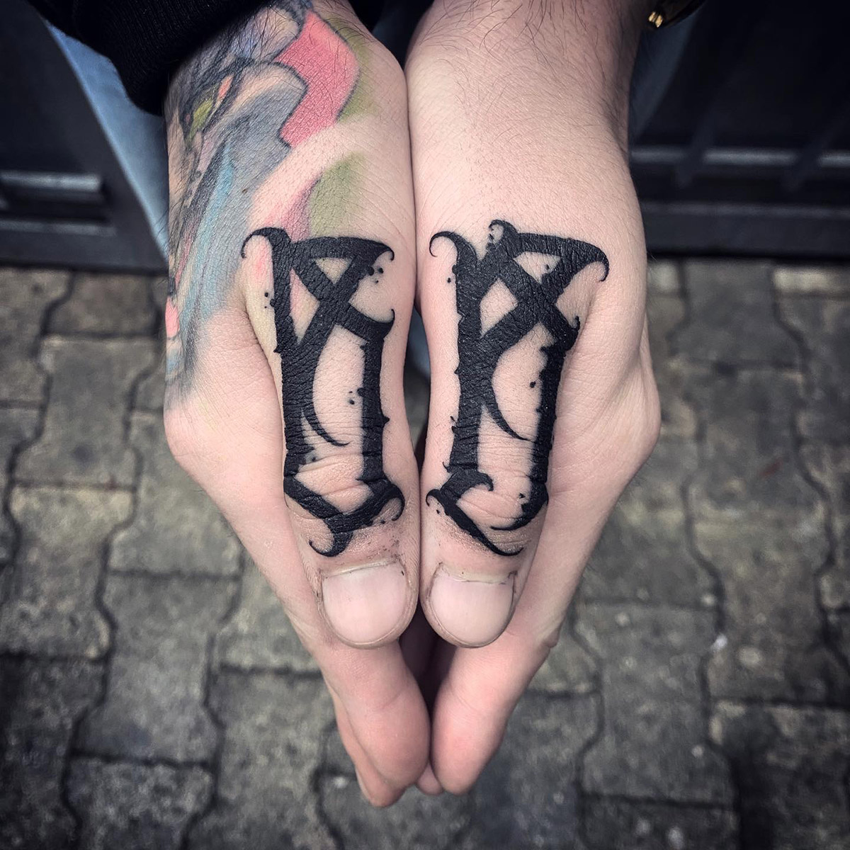
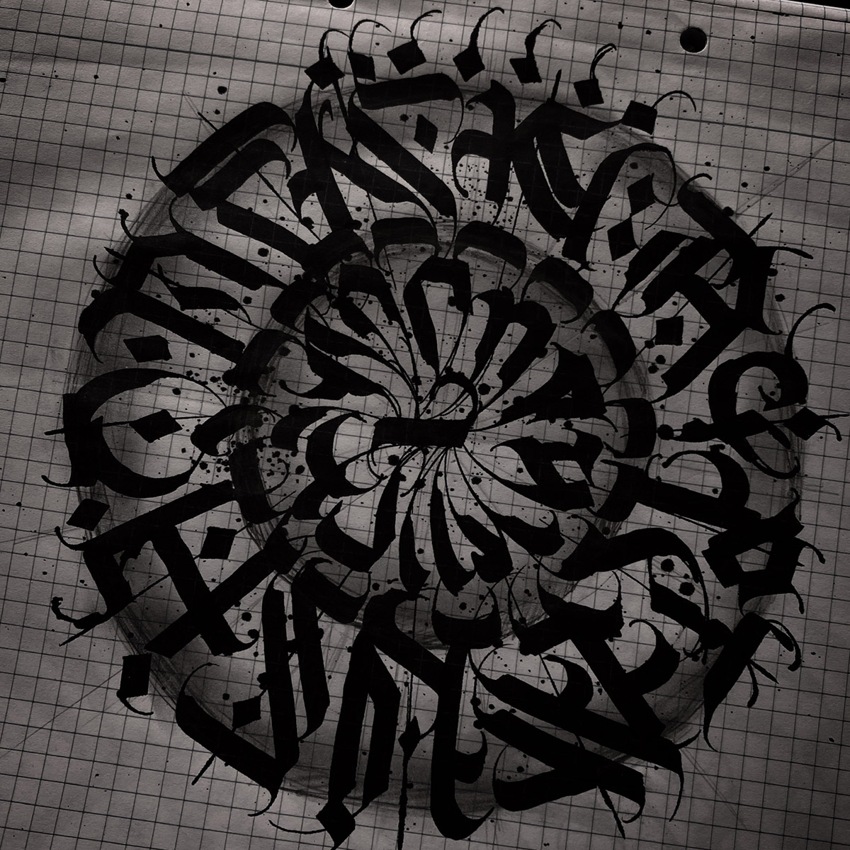
I work a lot on my sketches before I put everything in. I always start from a classical base, to get the composition, the shape of the letters, etc. right. As for my alphabet, it's a personal interpretation of a mixture of different styles and influences.
It's difficult to find your style with all the typefaces available?
It's a question of artistic approach, of affinity with the styles, the curves. And it's also instinctive.
What typefaces do you like best?
I like a lot of styles, but as long as I can deconstruct and make the lettering my own, I'm interested.
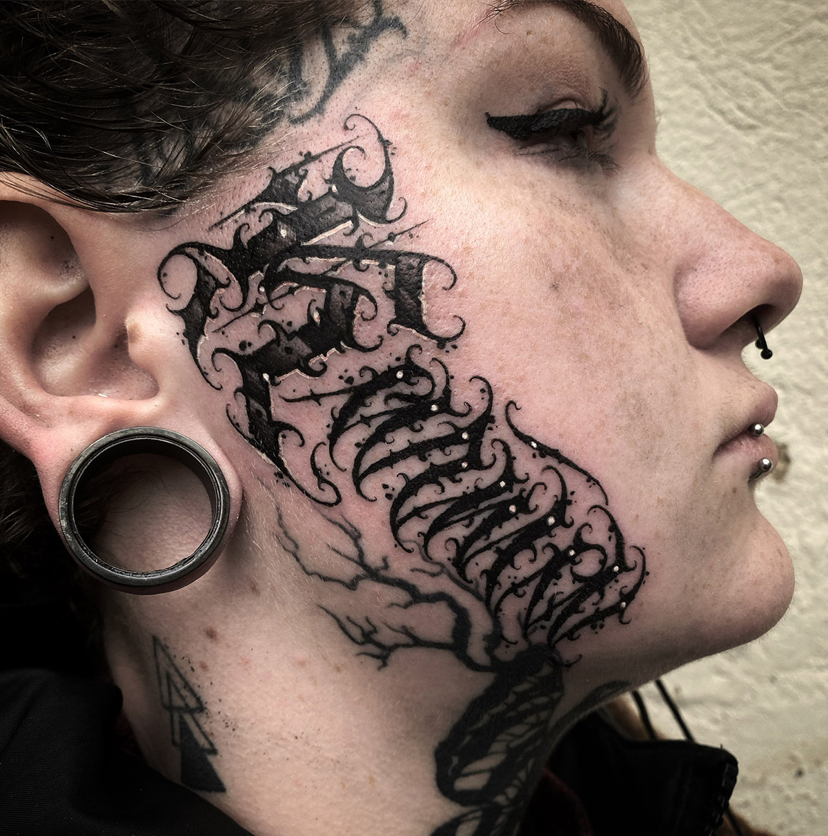
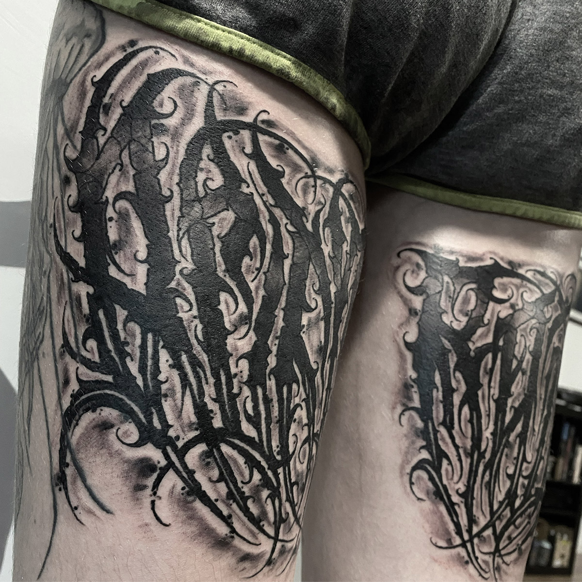
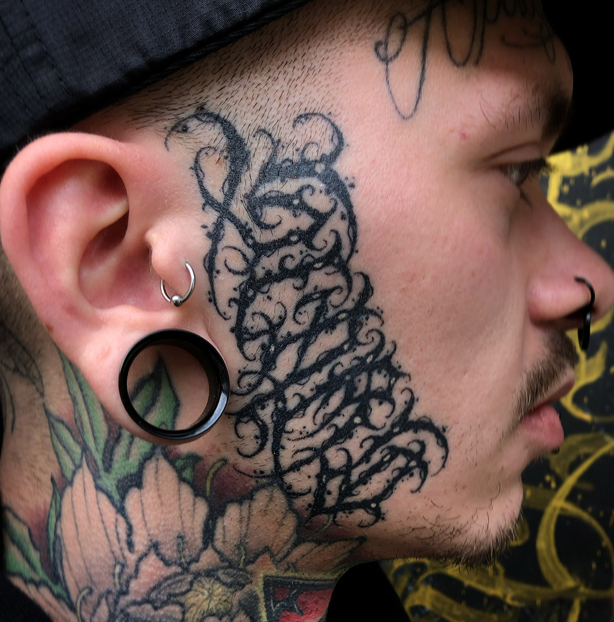
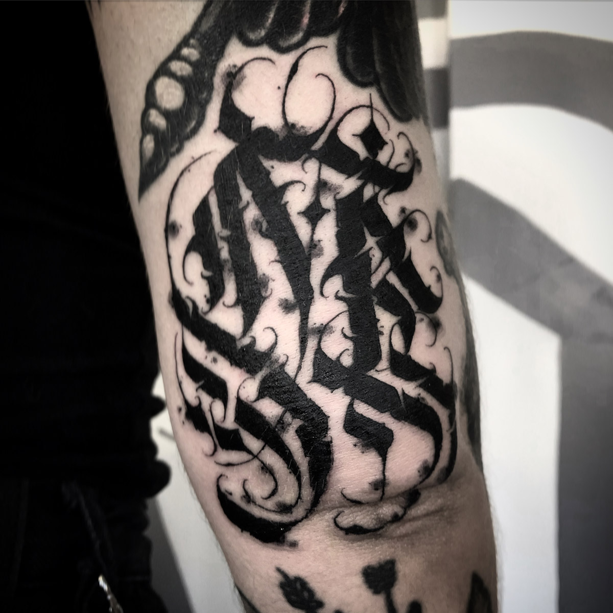
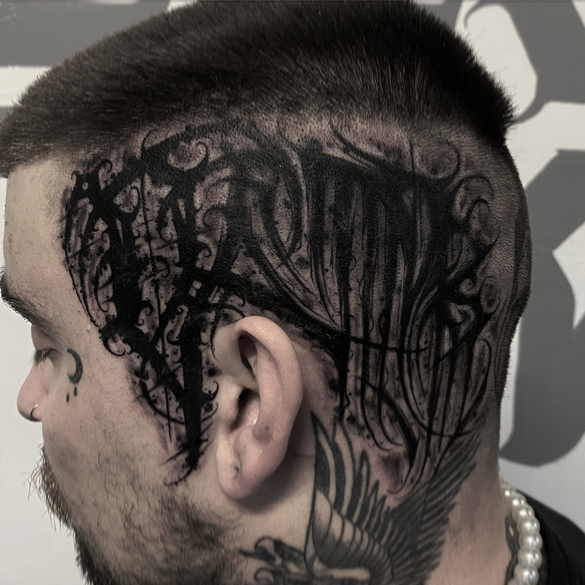
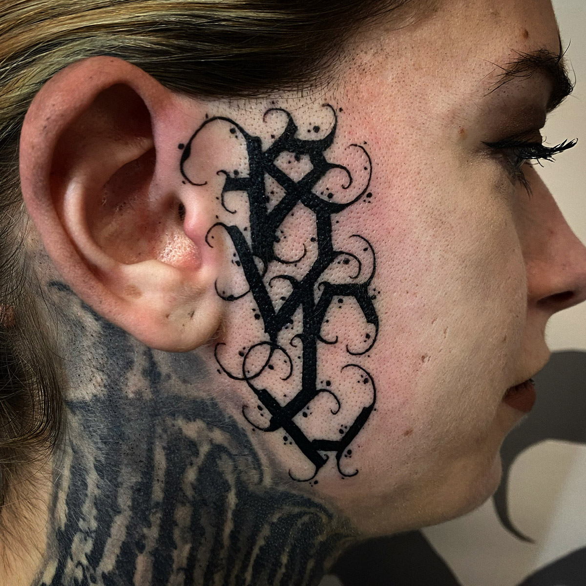
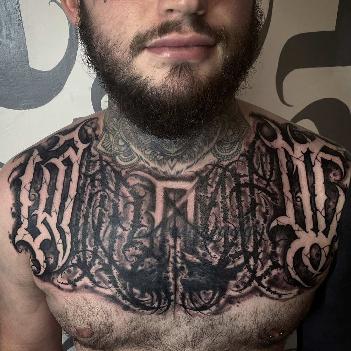
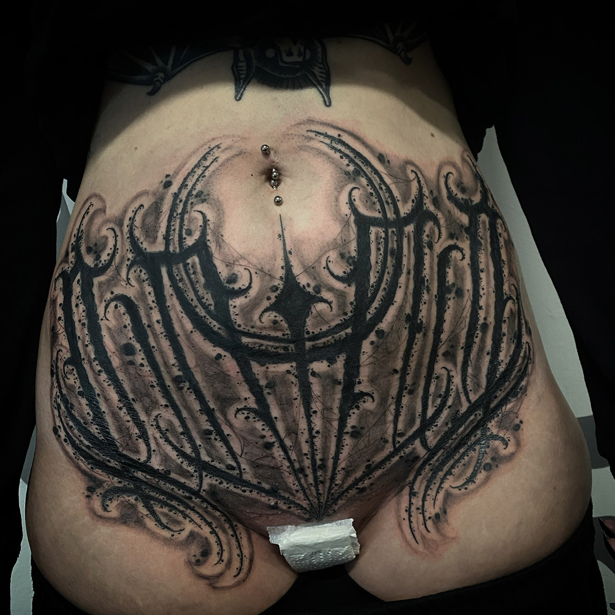
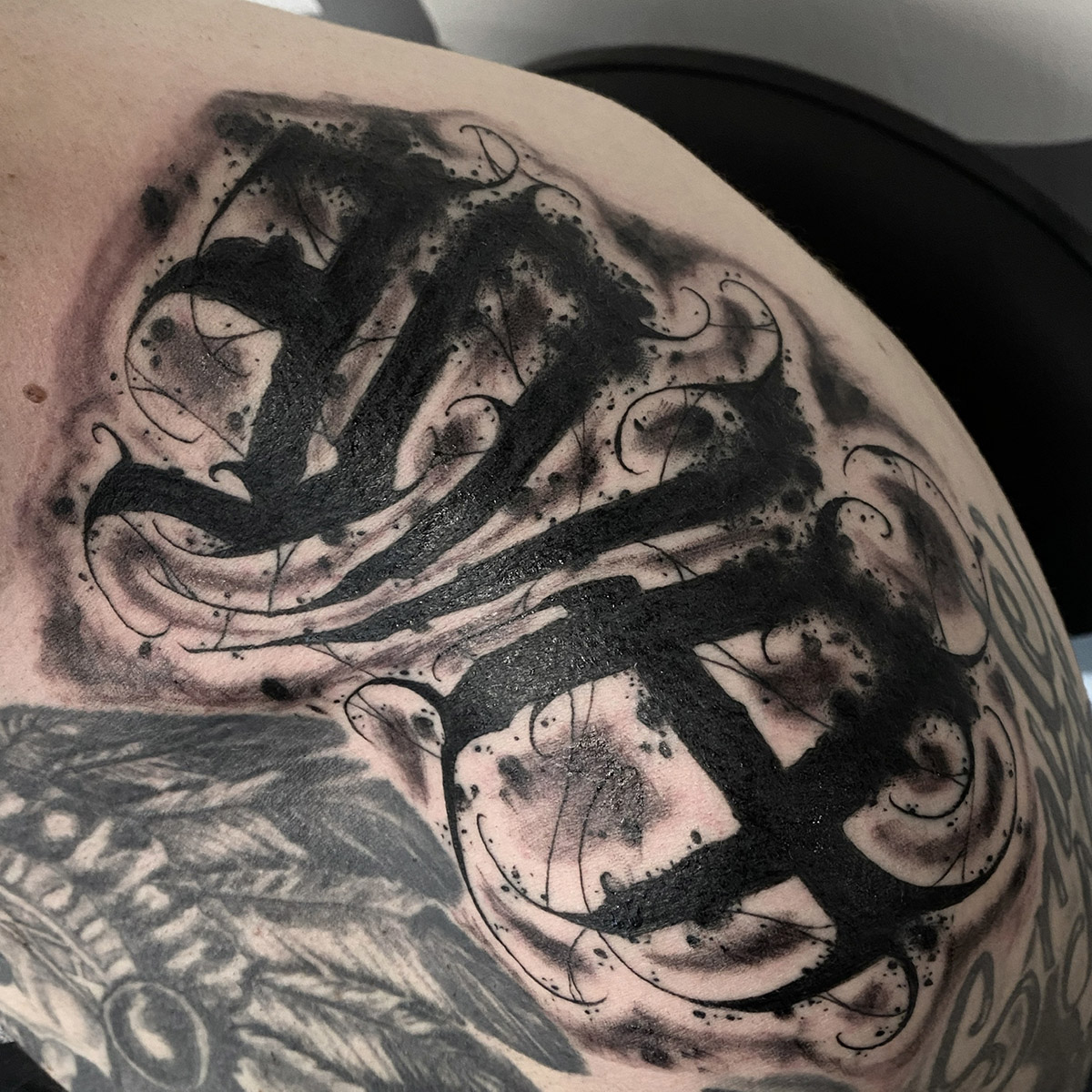
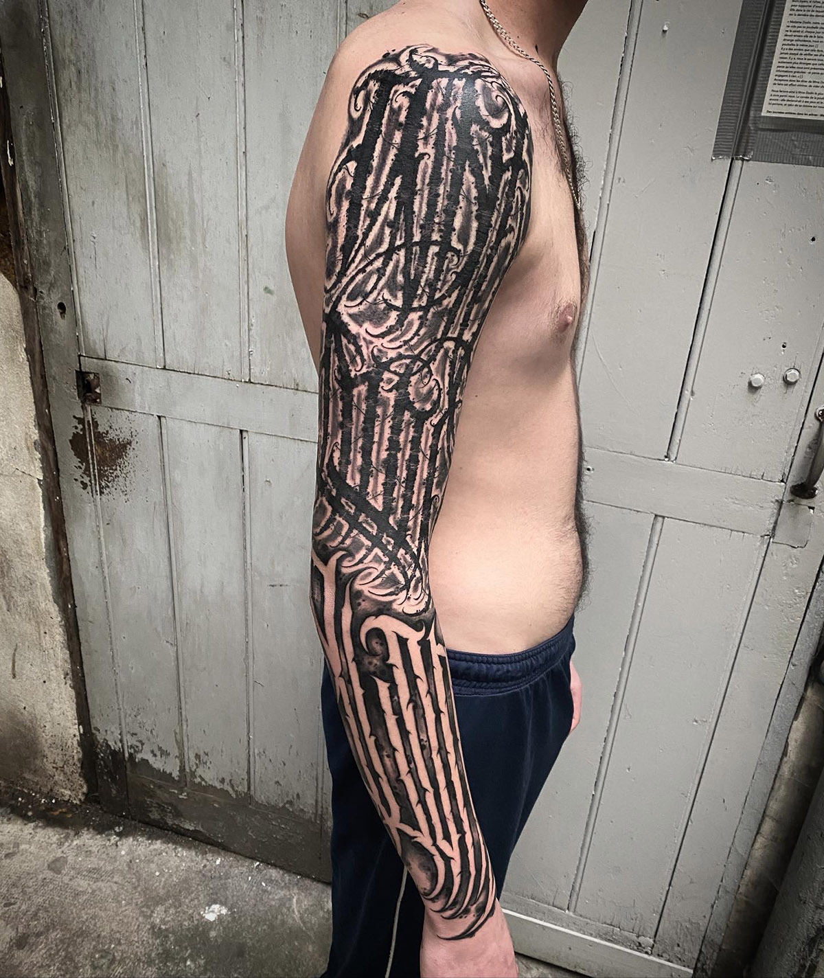
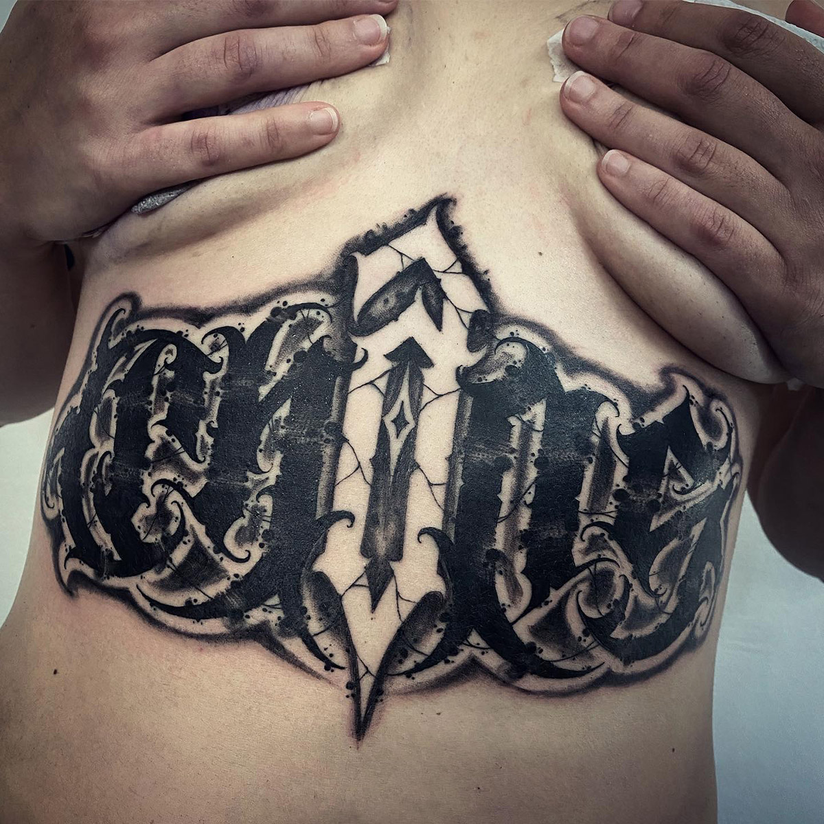
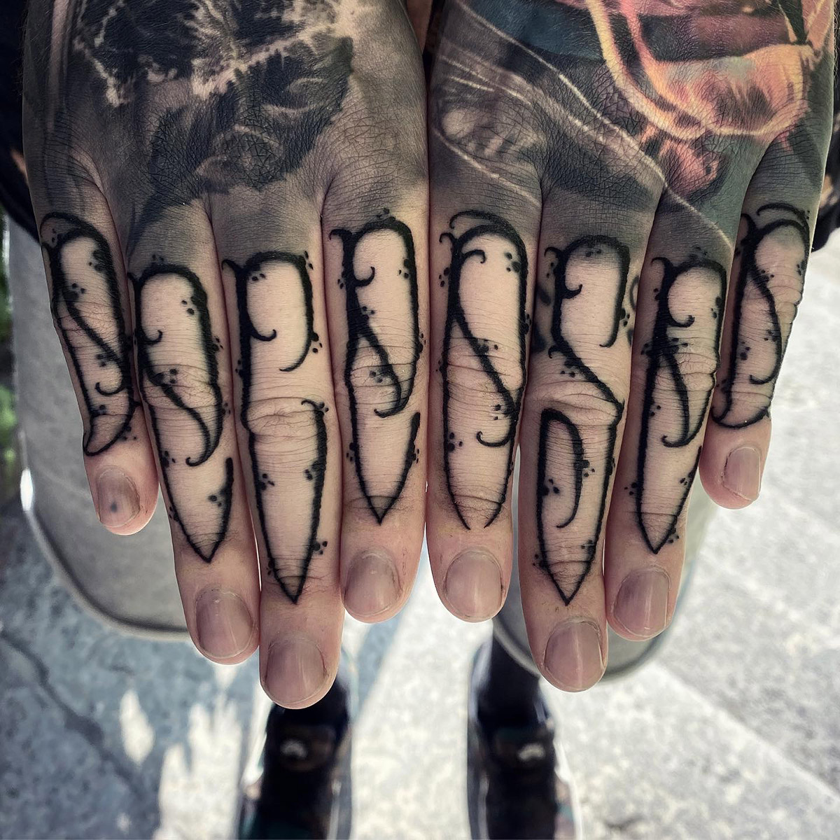
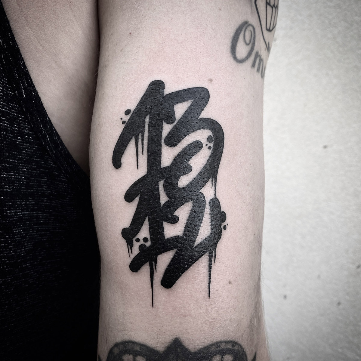
Some of them remind me of black metal bands’ logos, is dark lettering an exploration of this universe?
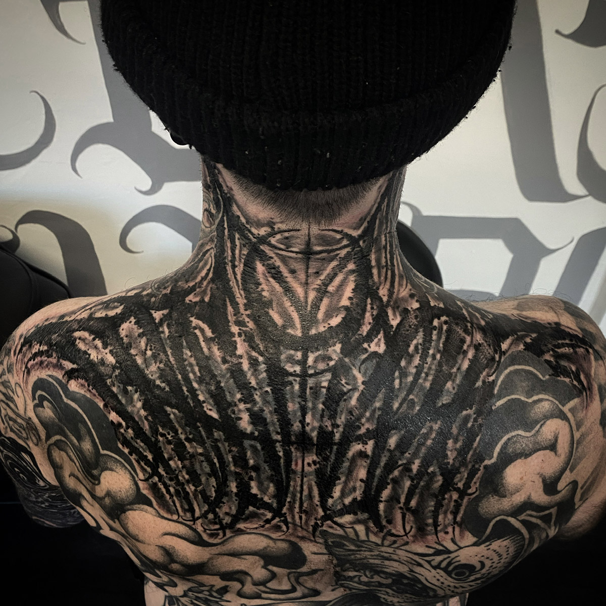
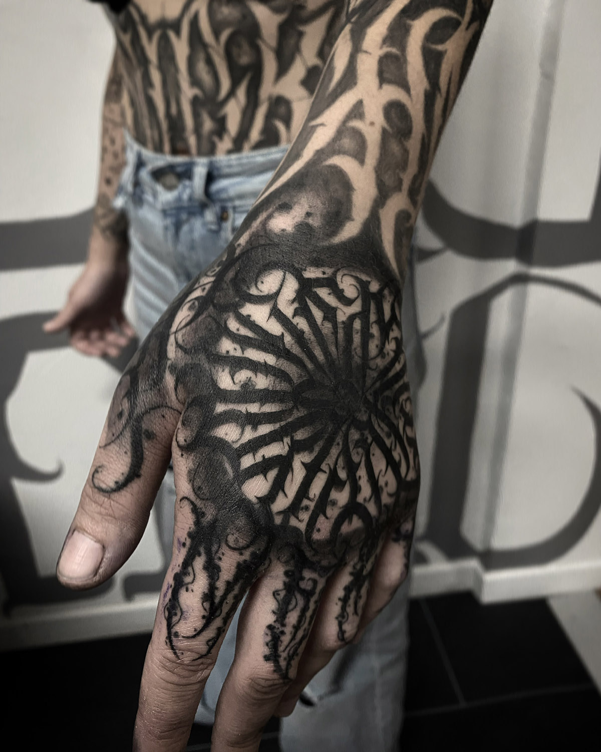
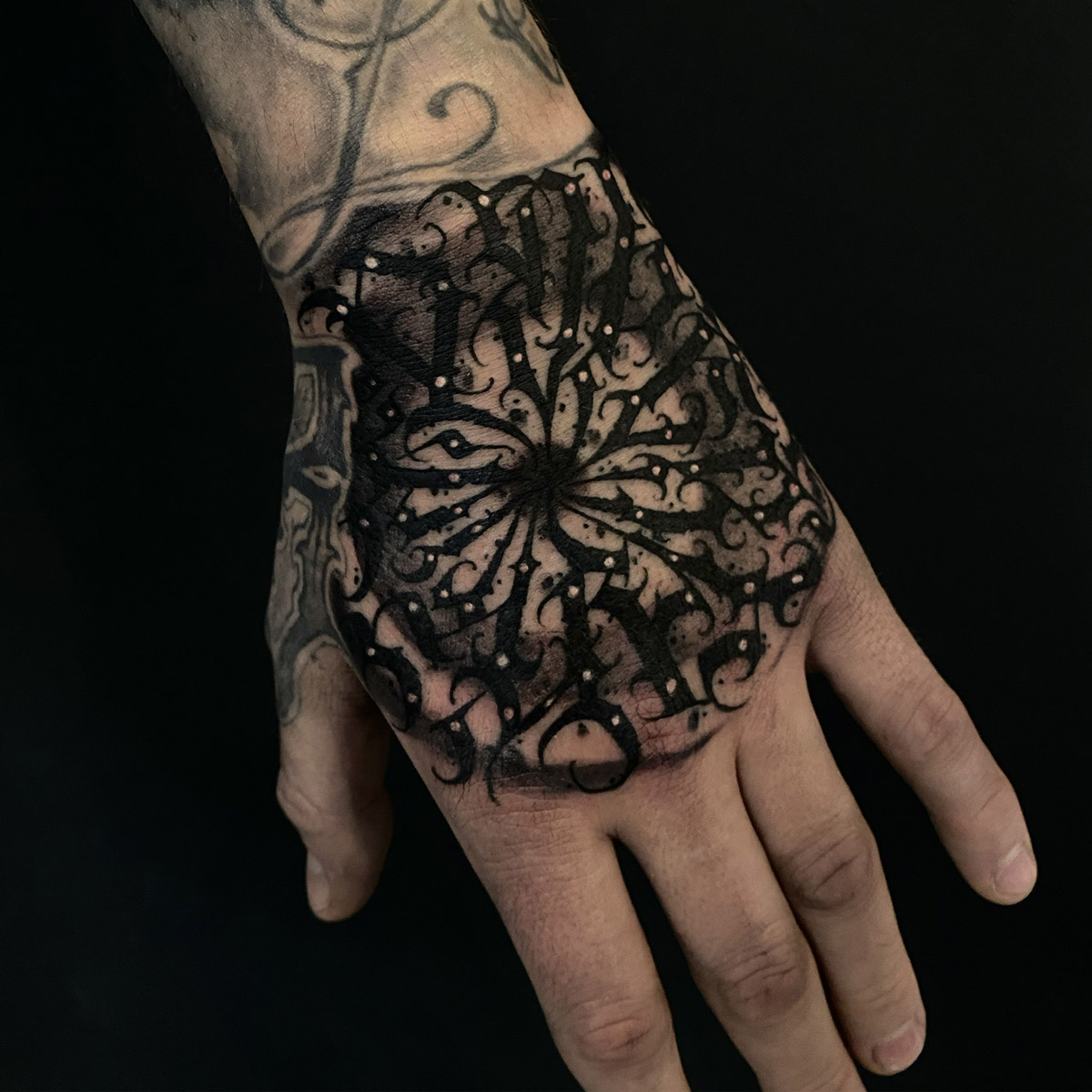
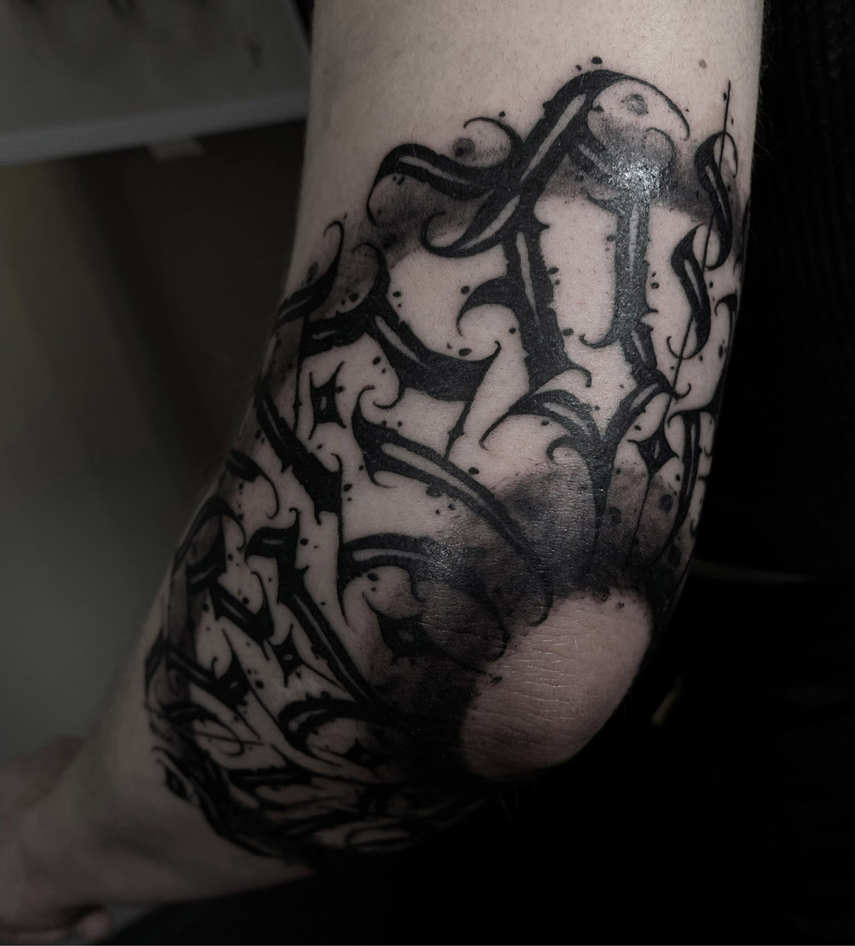
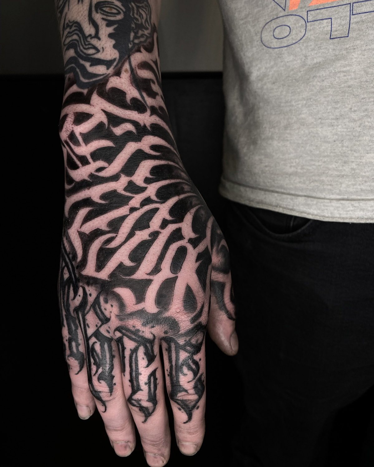
It's a big part of curiosity, for sure. I don't have a black metal culture, even if I've been around skateboard culture and my father has always had a rock culture, but breaking down the letters so much for me is something new and therefore interesting. It was nothing like what I was doing before in the Chicano style. It was all new and we broke the codes.
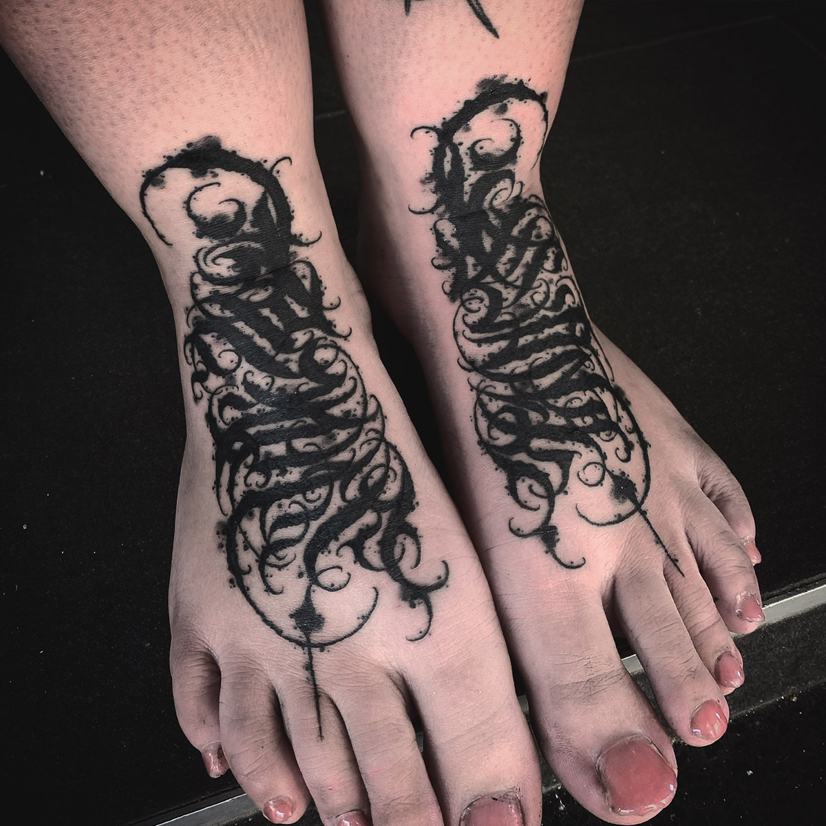
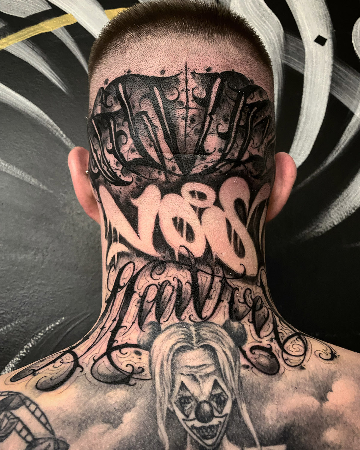
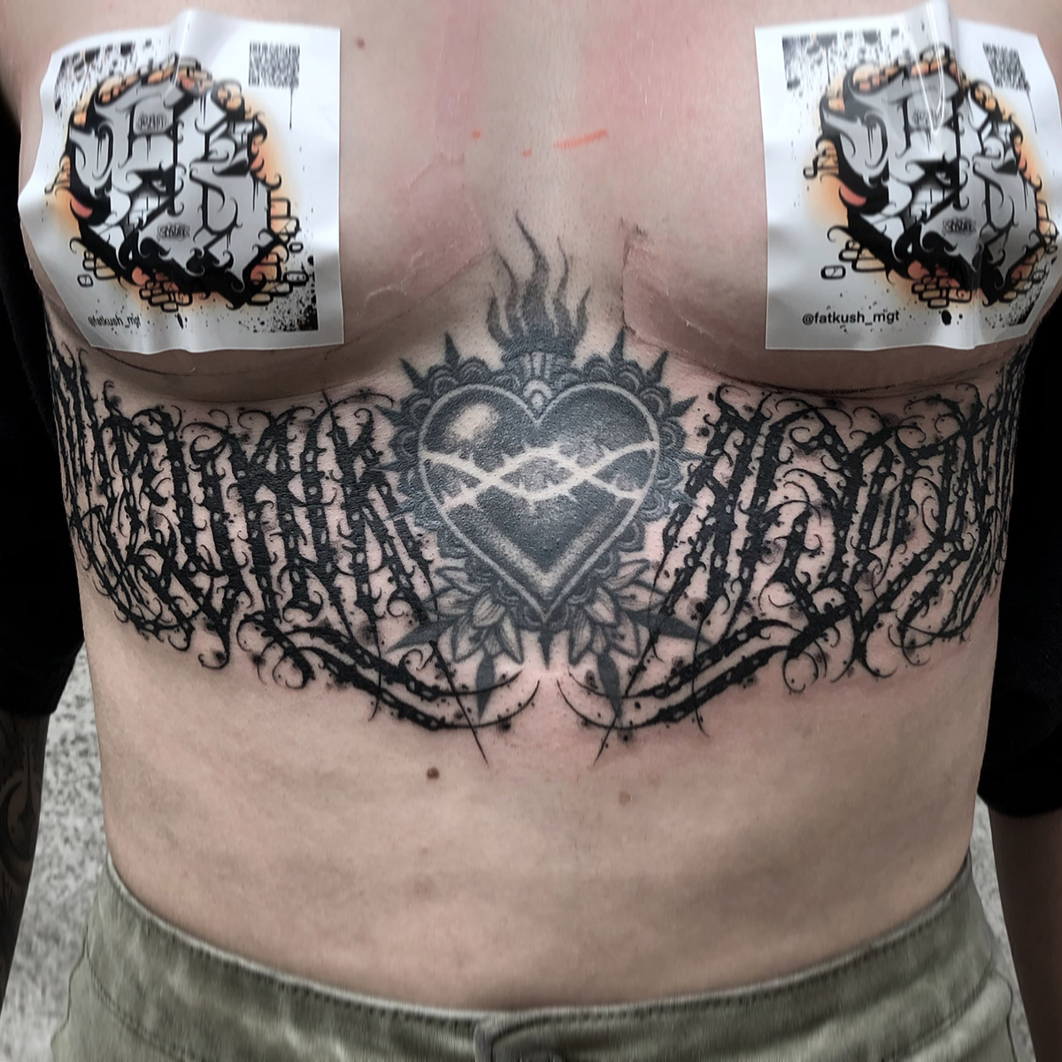
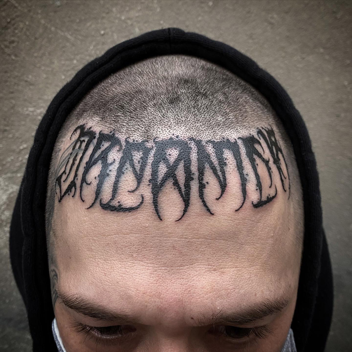
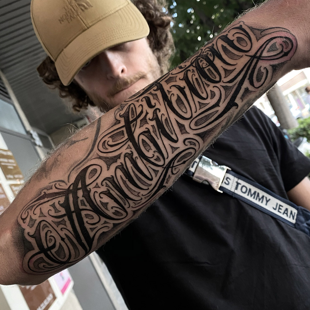
Words have an aesthetic, which varies according to the letters, their association and their number. Are there any words you like to work on more than others?
I have my favourite little letters, but that will remain a secret. Besides, I don't have a favourite word. What I prefer is the challenge of dealing with the space available for the tattoo and the person's desire.

Does the room determine the choice of typeface?
It has an important role for the person wearing the tattoo. The style chosen can be representative or completely opposite. But, it is true that most of the time I choose the style according to the word I am tattooing.
Readability or impact, should you choose?
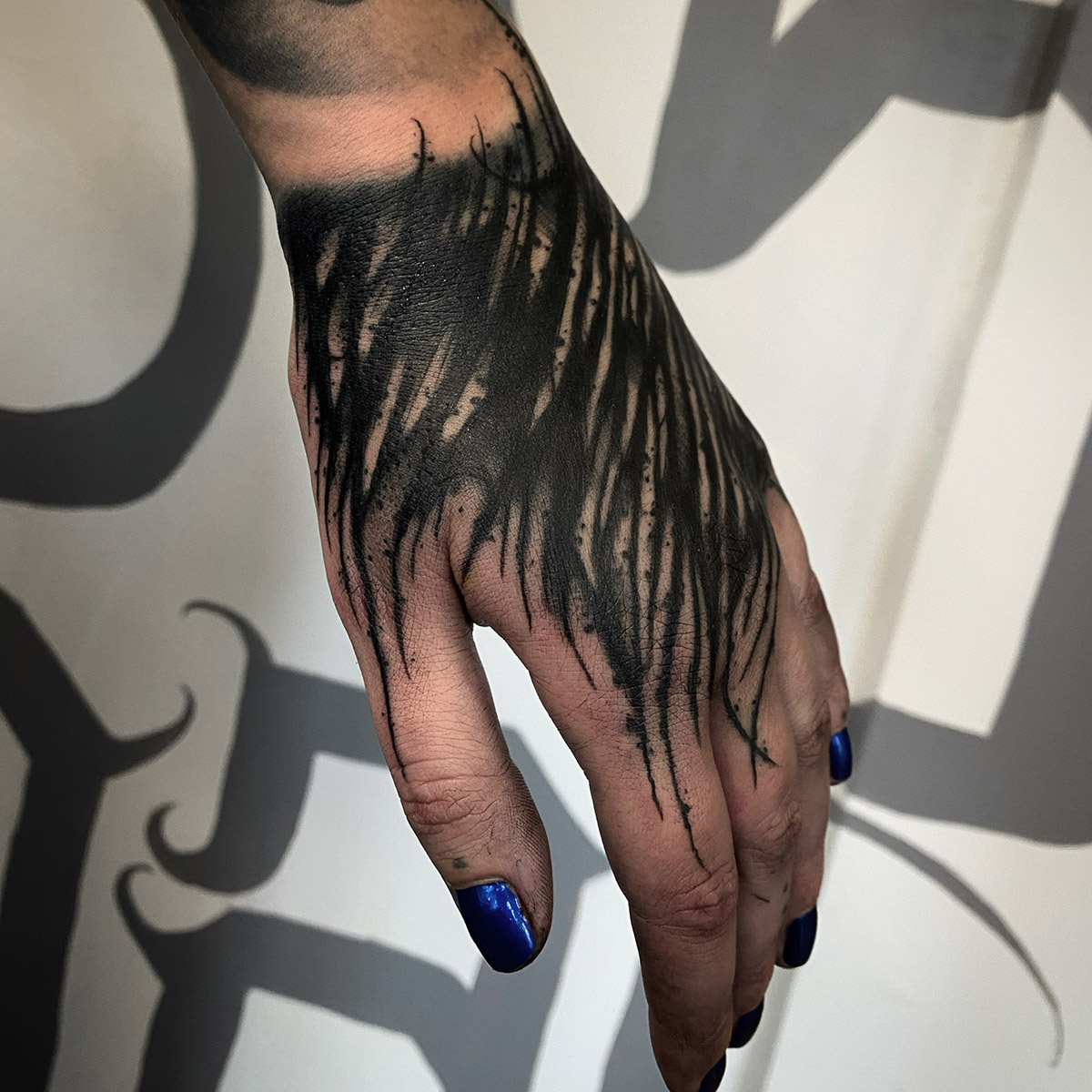
I think both are very important, but ultimately it depends on the individual. I may have a client who doesn't want it to be legible and another for whom it will be the opposite. As far as I'm concerned, I play with their morphology and their desires.
Do all messages have to be read?
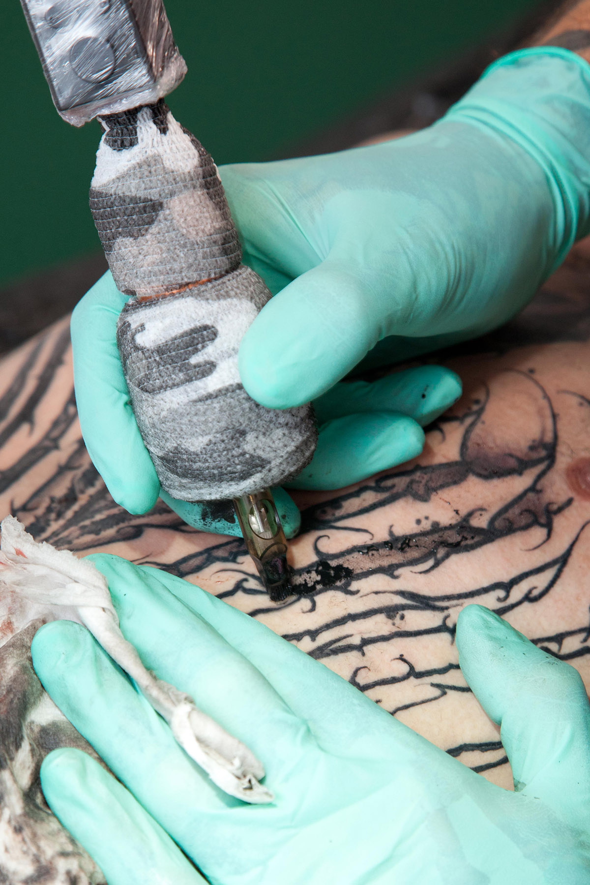
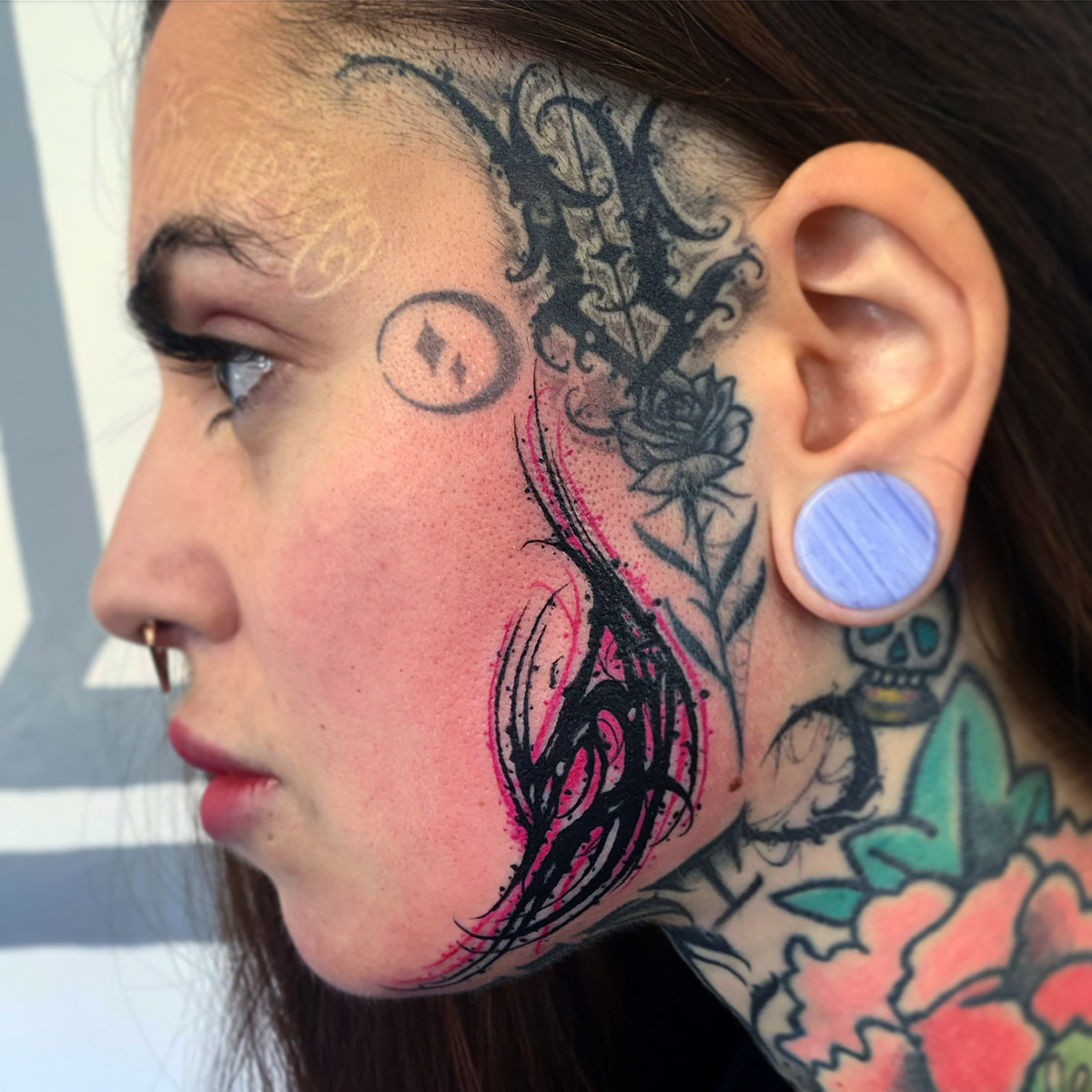
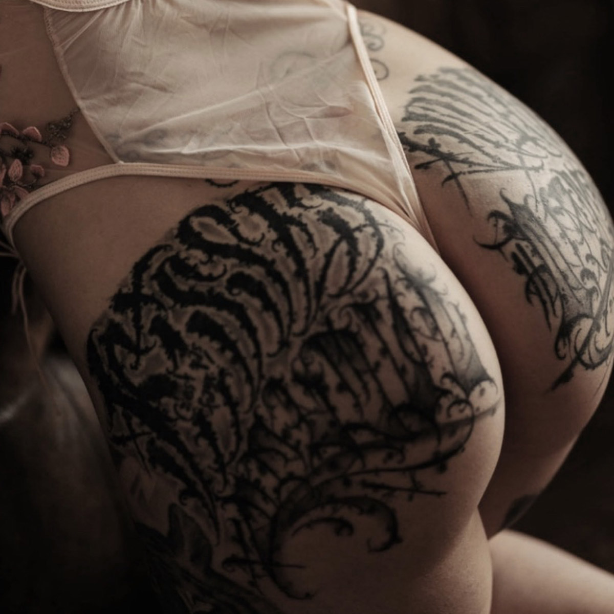
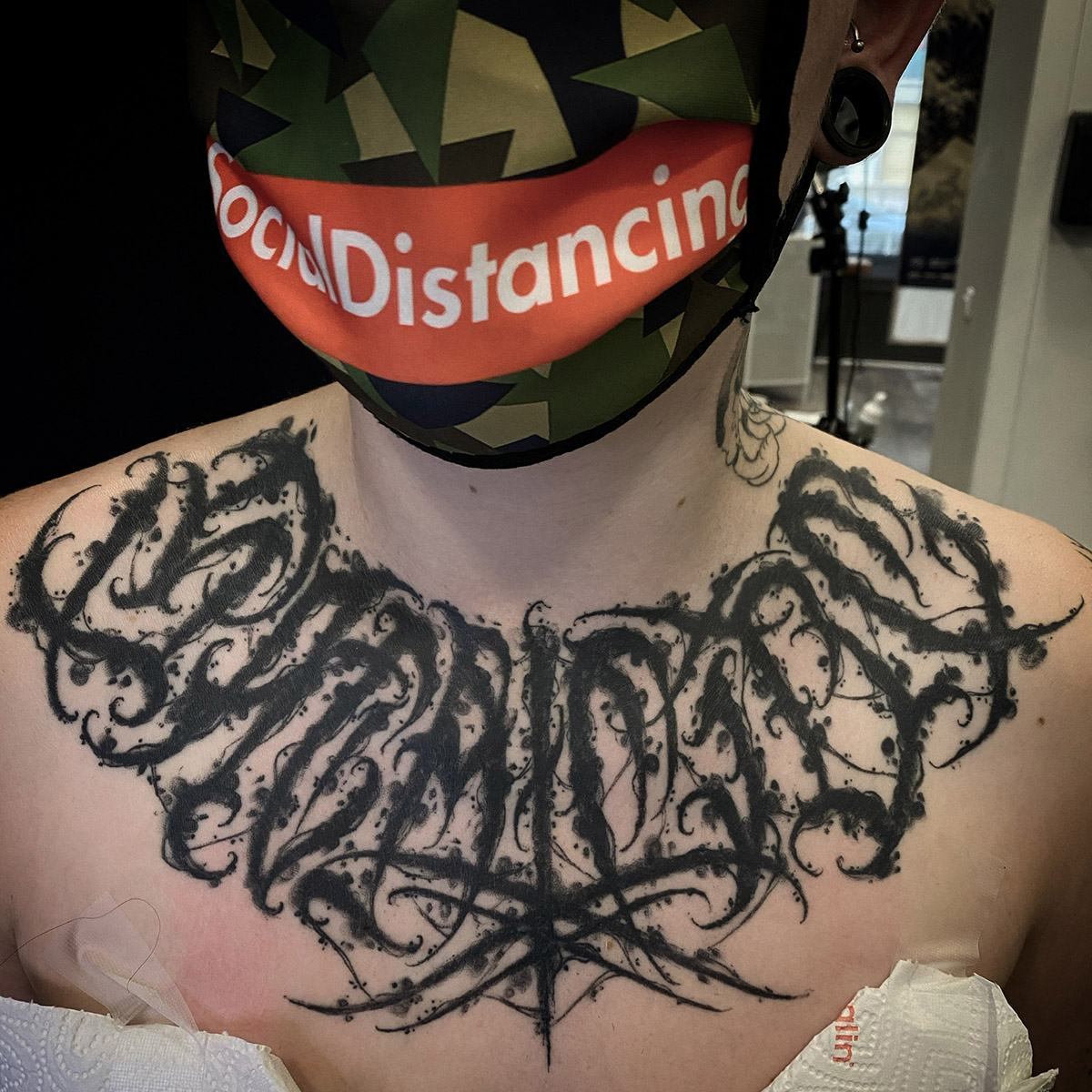
Not necessarily. More and more, I like to play with body shapes and movements. That's why I've also turned to dark lettering and abstract calligraphy. I think that some of my clients are deliberately looking for this unreadable and dark side, which I also like. But it must remain harmonious on the body.
How popular is lettering today?
It has been growing in popularity in France and in Europe for the last four or five years. At the beginning of my apprenticeship, lettering was a relatively unknown discipline in France, unlike in the United States or Latin America where this culture of lettering has existed for a long time in tattooing.
Do you have any artists to recommend to those who would like to explore the culture of the letter?
First of all, a big thought to those who left us in the last years and to their families: Norm, Aser one, Abis one, Boog who were masters as well as pioneers. I think that everything is a source of inspiration in calligraphy but if I had to name one, I would say Norm. He has influenced me a lot in my lettering journey. Lucho Morante is the first one I met on the French scene and he is the one who gave me the strength to give it all and not give up. Without forgetting Big Meas, Edgy letter, Blunt tattoo, Baganos, Gabriel tattoo who inspire me a lot in the field. And a big dedication to my crews born 2 script Krew and criminal lettering.
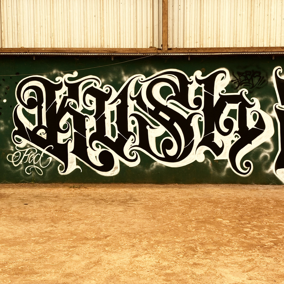
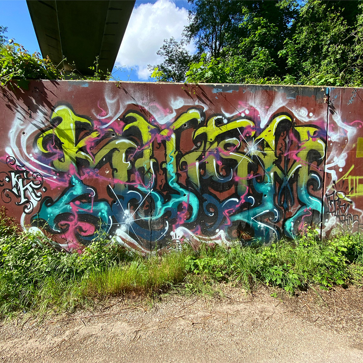
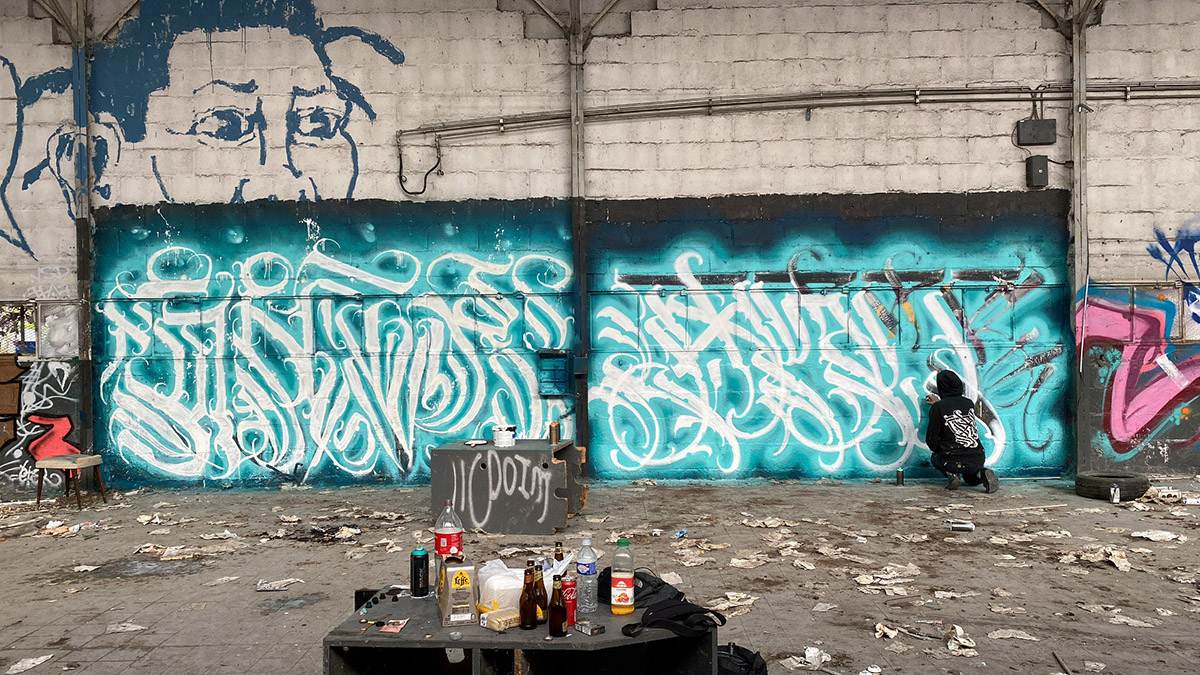
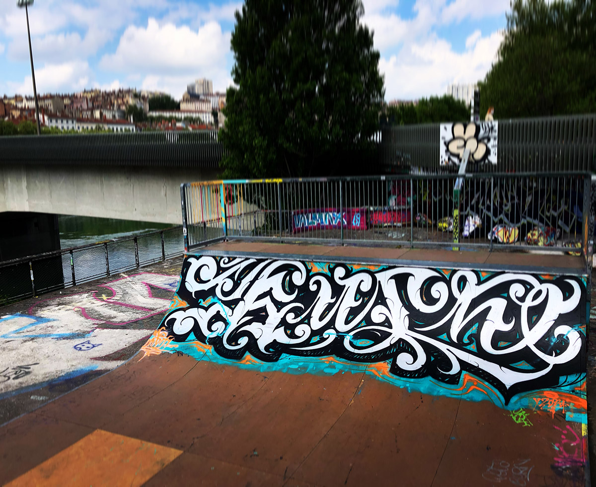
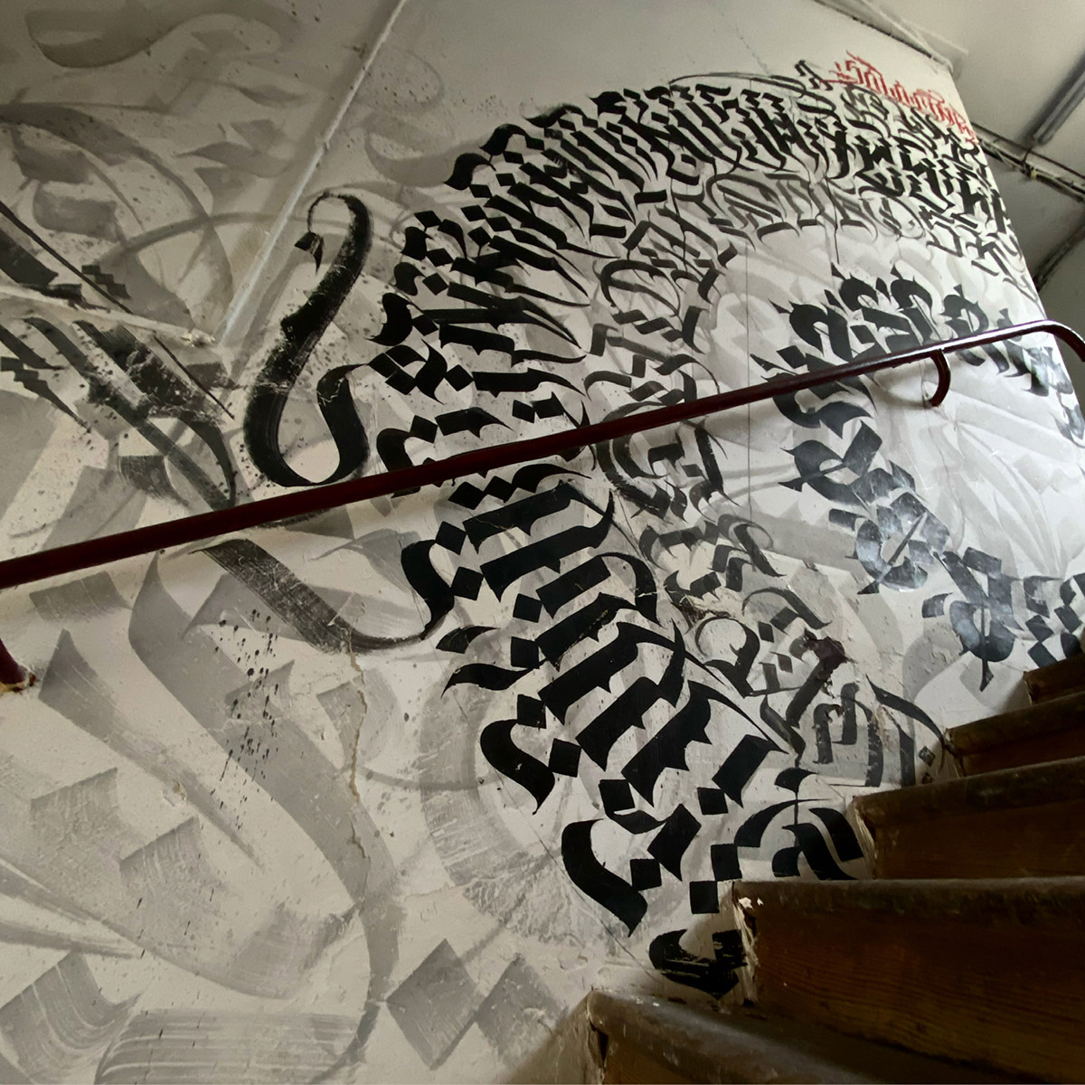
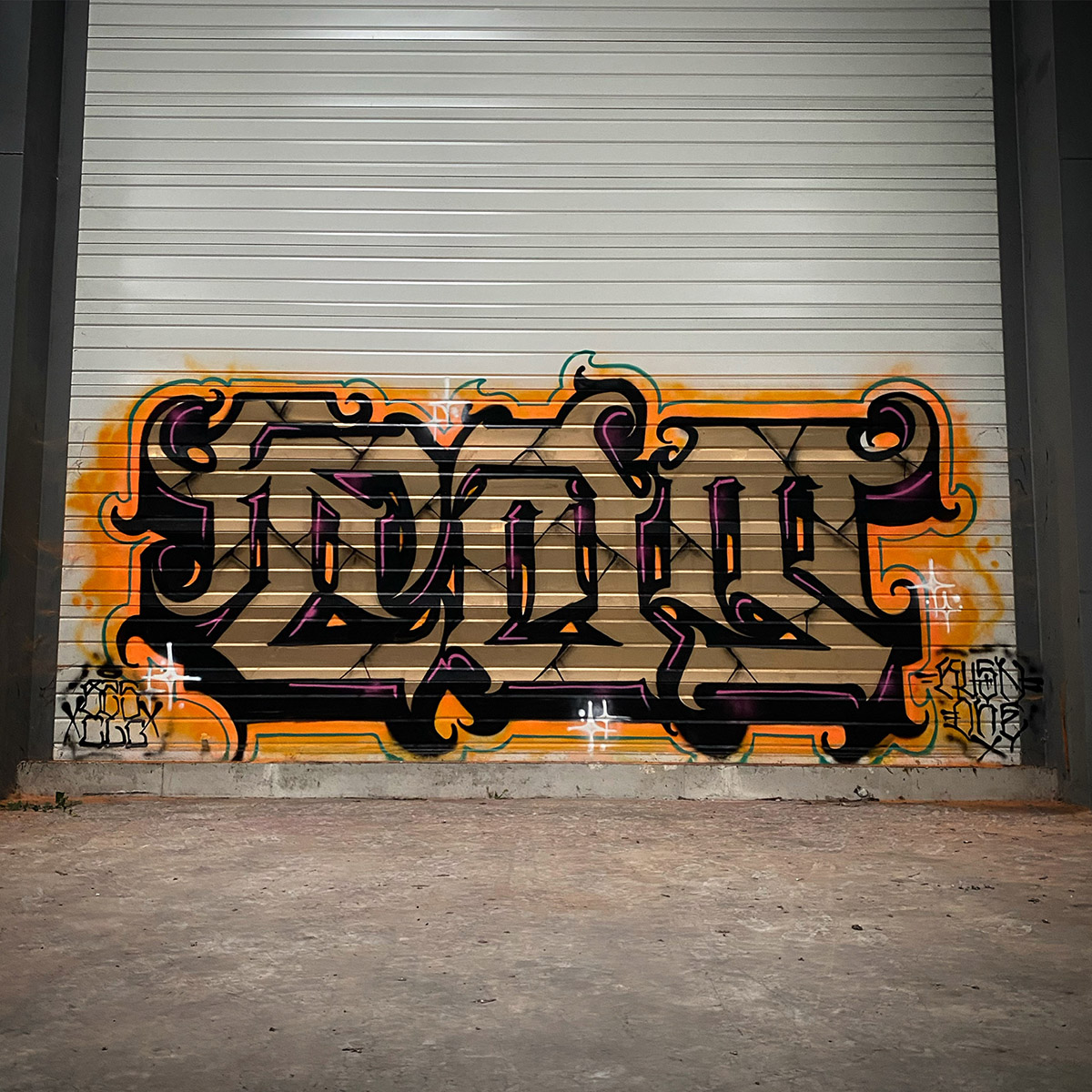
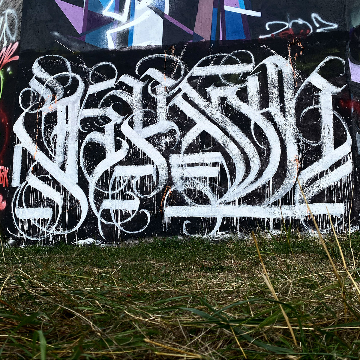
You have kept the pleasure of graffiti, as we can see on your Instagram, can you tell us about it?
Yes, it remains mixed and it evolves together. Painting a wall is free, it's also the necessary carte blanche to make the tattoo grow in parallel. It's also painting in another format, late at night with friends. + IG : @fatkush_mgt